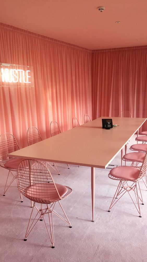
RECOVERY RECOMMENDATION FOR COLOR COMBIN IN DECORATION: MONOCHROME
When monochrome is mentioned, black and white combos come first. This is the result of using the glove differently in time. ” Monochrome ” is used to describe black and white designs when it comes to word fashion. Monochrome, however, means that a single color is used in different tones.
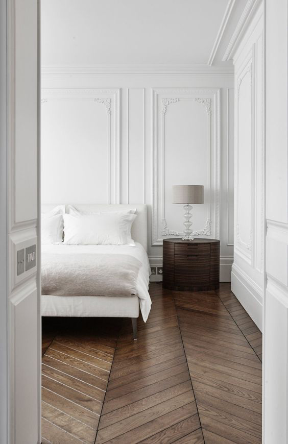
The first point we notice when decorating spaces is always the color harmony. Because the most important thing that reveals the properties of spaces is the colors. However, it is sometimes not easy to match this color on the spot. For this reason, it is best to go out on a single colored road in situations where it is difficult to combine colors. Choose for your favorite color space or room, and avoid worrying about whether it fits into a different color scheme.
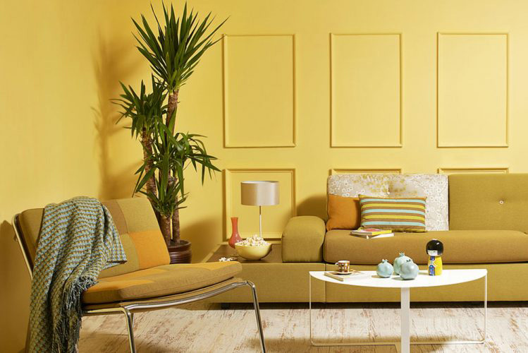
While decorating our house; we try to make the curtains harmonious with the carpets with the wall color of the furniture. To capture this harmony, we first look at the colors of the products we choose, not the fabric. Sometimes we spend hours to make a color decision. At this point, the monochrome technique is switched on. If you do not know which furniture color you want to blend with the wall color you choose, it makes your job easier to apply the same tones. Thanks to monochrome you can create a calm and harmonious decoration using a combination of different shades of color.
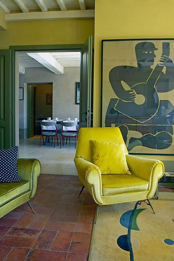
Using different colors while trying to create a living decoration can sometimes cause chaos. For this reason, you can create a moving and harmonious place by selecting for one color space and choosing these color tones in other accessories and furniture.
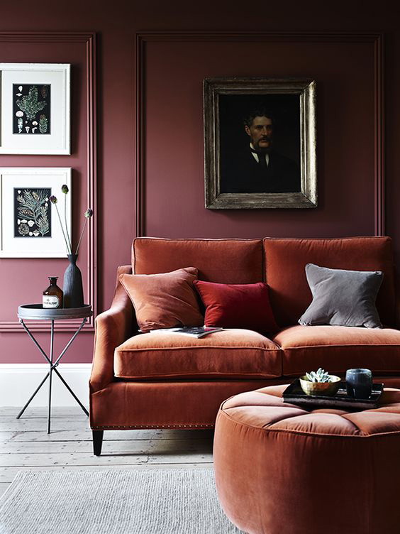
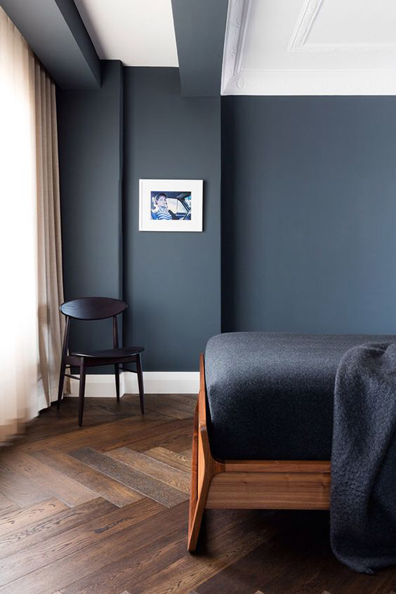
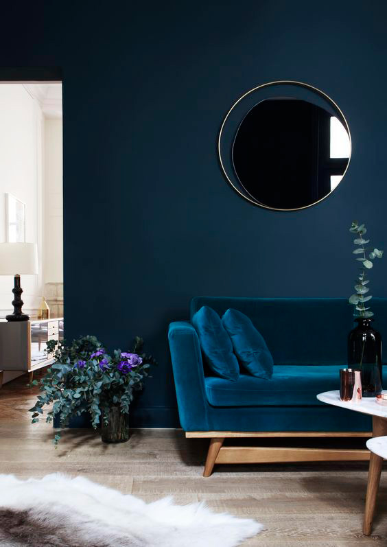
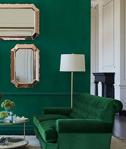
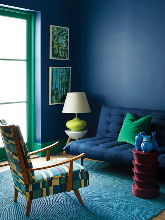
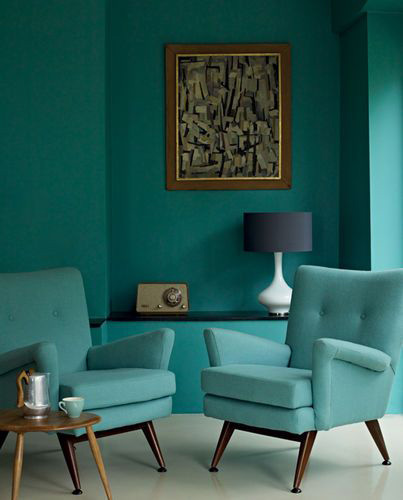
As it is in the living room, the sofa set preferred in the same tones as the walls creates a tranquil environment by creating a unity of the space. It provides continuity in puffs and pillows used in the same tones. In accessory selection, a light color other than dark main color illuminates the preference area. But a sharp transition with white color can be risky. For this reason, the use of gray and tones softens this transition.